Ownway
A health app that turns blood test results, DNA, and microbiome data into a personalised weekly nutrition plan.
Timeline
2022
Role
UX Designer
Product Type
Mobile app · Consumer health
Team
Solo project, immersion course
Tools
Figma · User interviews · Usability testing
Context
My Dream Project
Ownway is a dream I have had for a long time. A tool that gives anyone, regardless of how complex their condition or how overwhelmed their doctor is, access to real information and a clear, personal path toward better health.
This was my final project during a UX immersion course, and I used it to explore the full design process from research through to usability testing.
The Problem
Chronic Health Conditions Unanswered
Chronic illness is on the rise, and the system is not built for it. Traditional medicine does remarkable work in acute and surgical care, but chronic conditions demand something different: deeper, longer observation that modern medicine simply does not have the capacity for.
Patient numbers increasing
60% of adults globally live with at least one chronic condition, and the number is growing. The system was not designed for this scale.
GPs have no capacity
A 15-minute appointment cannot hold a chronic condition. There is no time for the depth of observation these patients actually need.
Lifestyle choices are ignored
Diet, sleep, movement, stress. The factors that drive most chronic conditions are rarely part of the clinical conversation.
Pharma sells a solution to the symptom
Medication manages what is visible. The underlying cause, often rooted in how someone lives, goes unaddressed.
The hard truth
Drugs cannot cure disease.
They can only manage symptoms.
Research
Across the board
I spoke with a wide range of people: different ages, backgrounds, lifestyles, and health conditions. Because this is a subject I care deeply about, I let the research run longer than I normally would. The conversations kept opening up new directions, and I wanted to follow them.
The volume of that research ultimately helped me define two distinct user personas and clarify the business models that could make this kind of product viable.
The Primary Persona
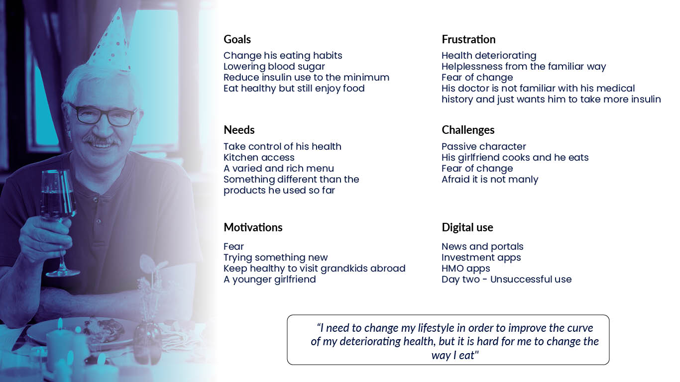
David, 65
David has had diabetes for 26 years. He knows it well enough to manage it, but not well enough to change it. His girlfriend cooks for him, so his diet is not really his own. He has tried apps, seen dietitians, read the articles. None of it stuck. The advice was always too generic, too rigid, or too much work to follow.
What David needs is someone who actually believes he can get better, understands what that would take for his specific body and life, and helps him get there.
User Flow
Premium membership: from first test to weekly menu
The premium flow is built around one idea: the app does the work. A nurse visits to take metrics, the results feed into the system, and the user receives a personalised plan. No configuration required.
Business Model
Two tiers, one goal
The research made clear that not every user arrives at the same starting point. Some want the full picture. Others want to take it step by step. The business model is built around that difference.
Basic (free)
Questionnaire-driven. Users answer questions about their health, lifestyle, and goals, and receive a sample personalised programme. Enough to be useful. Designed to show what the full tier can offer.
Premium (subscription)
A nurse visits at home to take blood, DNA swabs, and biometric measurements. The full data set feeds into the system and generates a truly personalised plan, updated as the user's results change.
B2B / insurance
Preventive health is cheaper than treatment. Employers and insurers have a direct financial incentive to keep people well. A white-label or partnership model could make Ownway accessible at scale.
Ongoing retesting
The plan should evolve as the person does. Periodic retesting, bundled into the subscription, keeps the recommendations accurate and creates a long-term relationship with the product.
Book a Nurse
You book a person, not a slot
The early designs focused on scheduling: pick a date, pick a time. But the more interesting design question was who is coming to your home. Showing the nurse's photo and name changed the dynamic entirely. Users reported feeling more comfortable, more prepared, and more likely to actually follow through with the appointment.
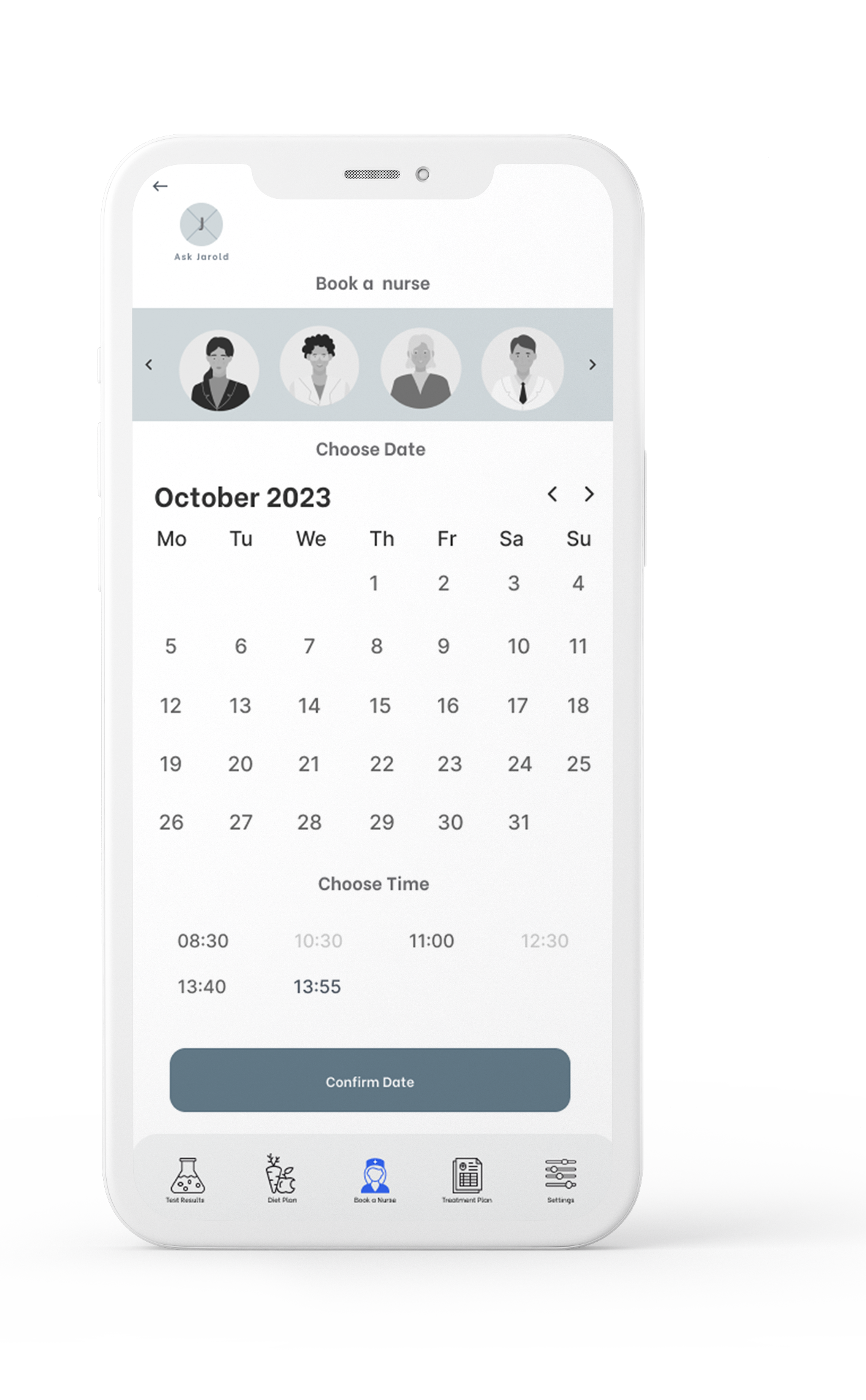
Research consistently shows that seeing a face creates accountability in both directions. A user who knows who is coming treats the appointment differently. A provider who is visible performs differently too.
This is well documented in service contexts: a study on hotel housekeeping found that guests who saw a photo and brief note from their room cleaner left significantly larger tips and were measurably more considerate of the room. The face turns a transaction into a relationship.
The same principle applies here: booking a nurse you can see is a fundamentally different experience from booking an anonymous time slot.
Test Results
Show what matters, not what is normal
Out-of-range results are surfaced at the top, displayed with a visual range indicator so the user can immediately see where they sit. Each flagged result links directly to personalised food recommendations, so the screen answers two questions at once: what is off, and what to do about it.
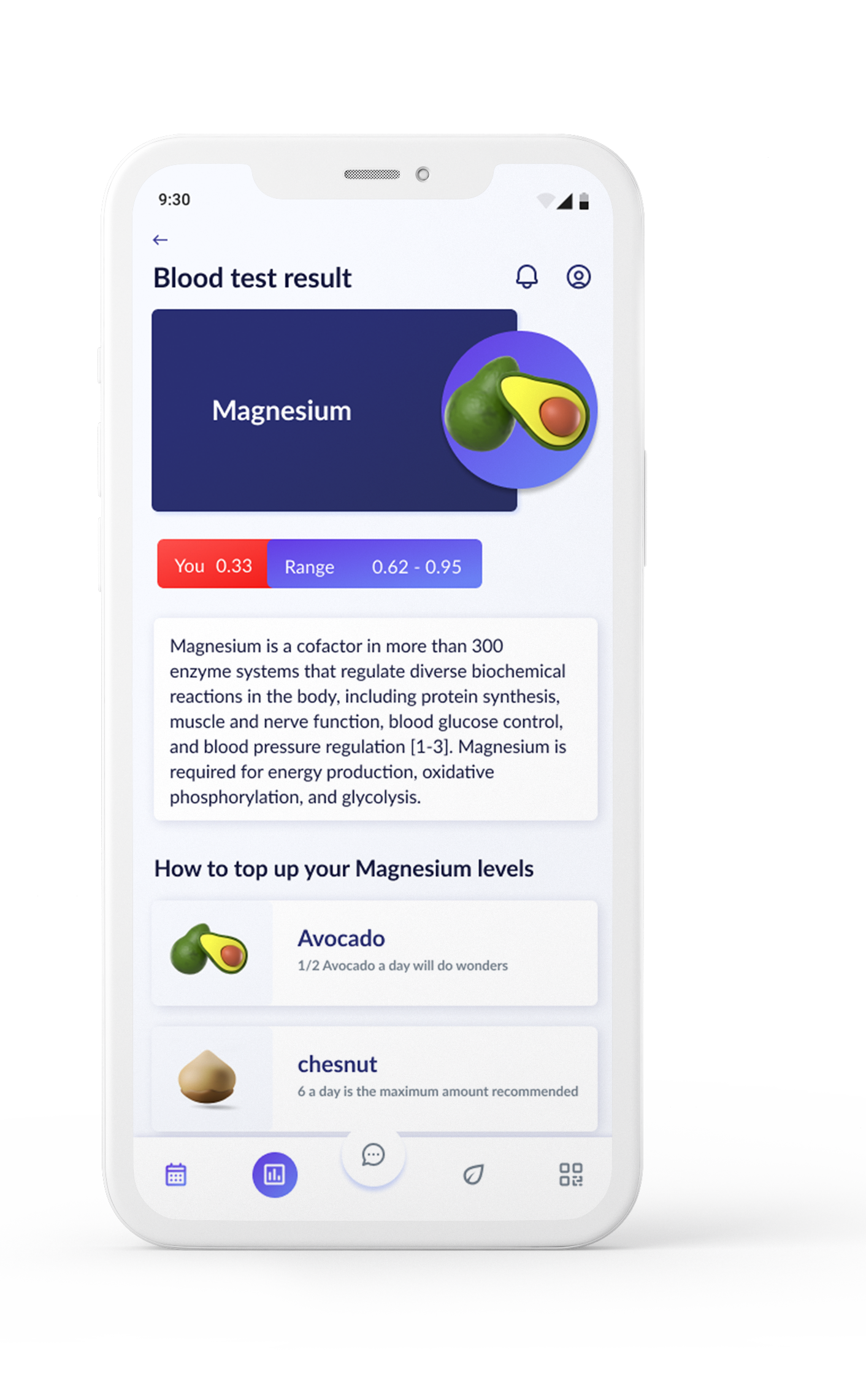
Out-of-range results appear at the top, each with a visual range indicator showing exactly where the user sits. Each result links directly to personalised food recommendations.
Weekly Menu
Three options per meal, nothing to configure
Each day of the week shows three curated meal options, built around the user's test results and a short eating preferences questionnaire. The user picks what appeals, and the shopping list populates automatically. No rearranging, no manual swaps, no calendar to manage.
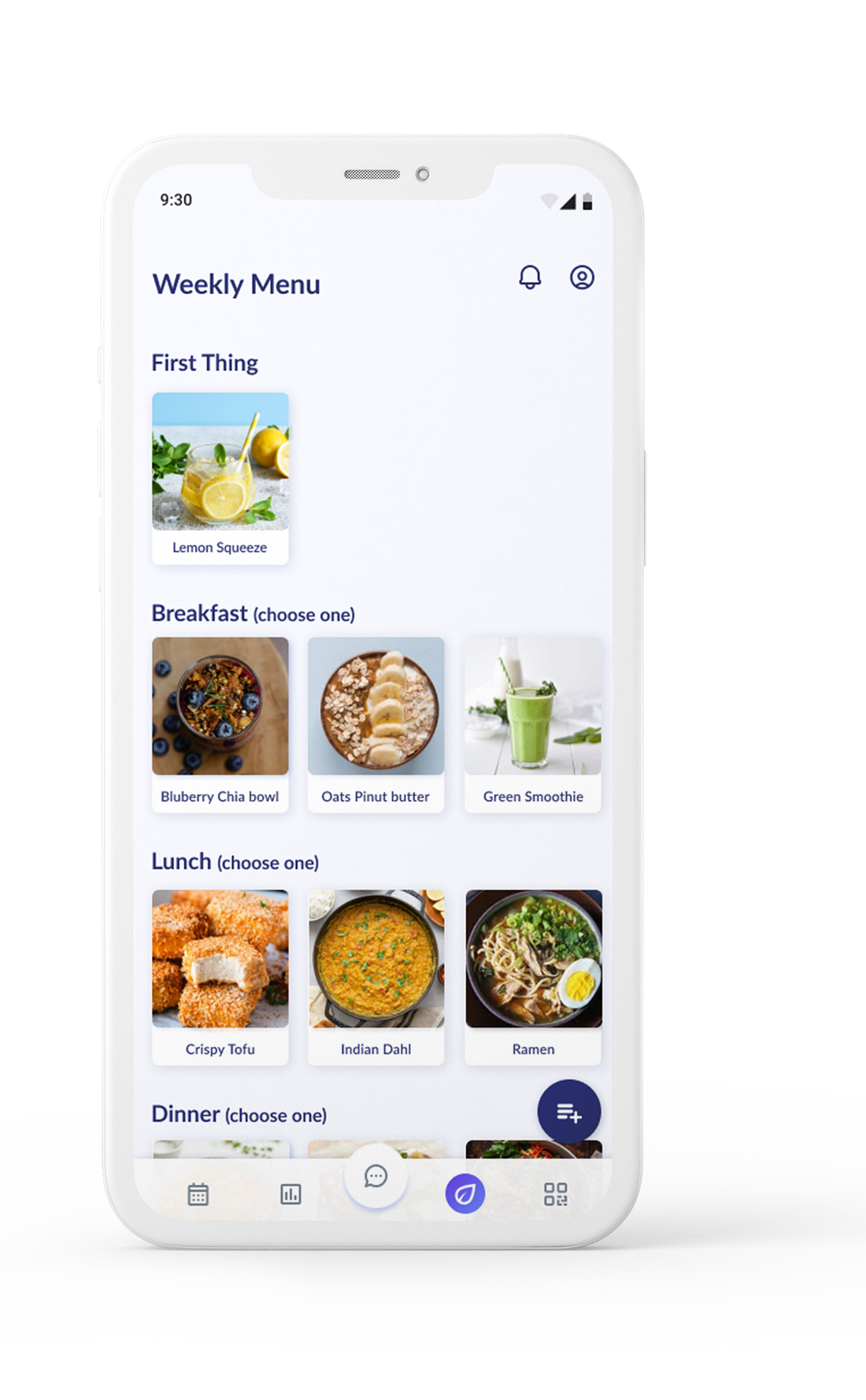
Three curated meal options per day, built around the user's test results and eating preferences. The shopping list fills in automatically as selections are made.